1. display属性
display: block; 块级元素,垂直显示,宽度自动撑满,可以设置宽高。display: inline; 内联元素,水平显示,宽度自动收缩,不能设置宽高。display: inline-block; 内联+块级元素,水平显示,既可以设置宽高又可以水平显示。display: flex; 弹性布局,适合用平均分布等,详情参考【传送门1】,【传送门2】。
2. position属性
position: static; 默认position: absolute; 绝对定位position: relative; 相对定位position: fixed; 相对于浏览器窗口进行定位position: sticky; 粘性定位,该定位基于用户滚动的位置position: inherit; 从父元素继承 position 属性
3. 默认块级元素
1
2
3
4
5
6
7
8
9
10
11
| .parent {
width: 500px;
height: 100px;
background-color: antiquewhite;
}
.mydemo0 {
height: 20px;
background-color: goldenrod;
margin-top: 10px;
}
|
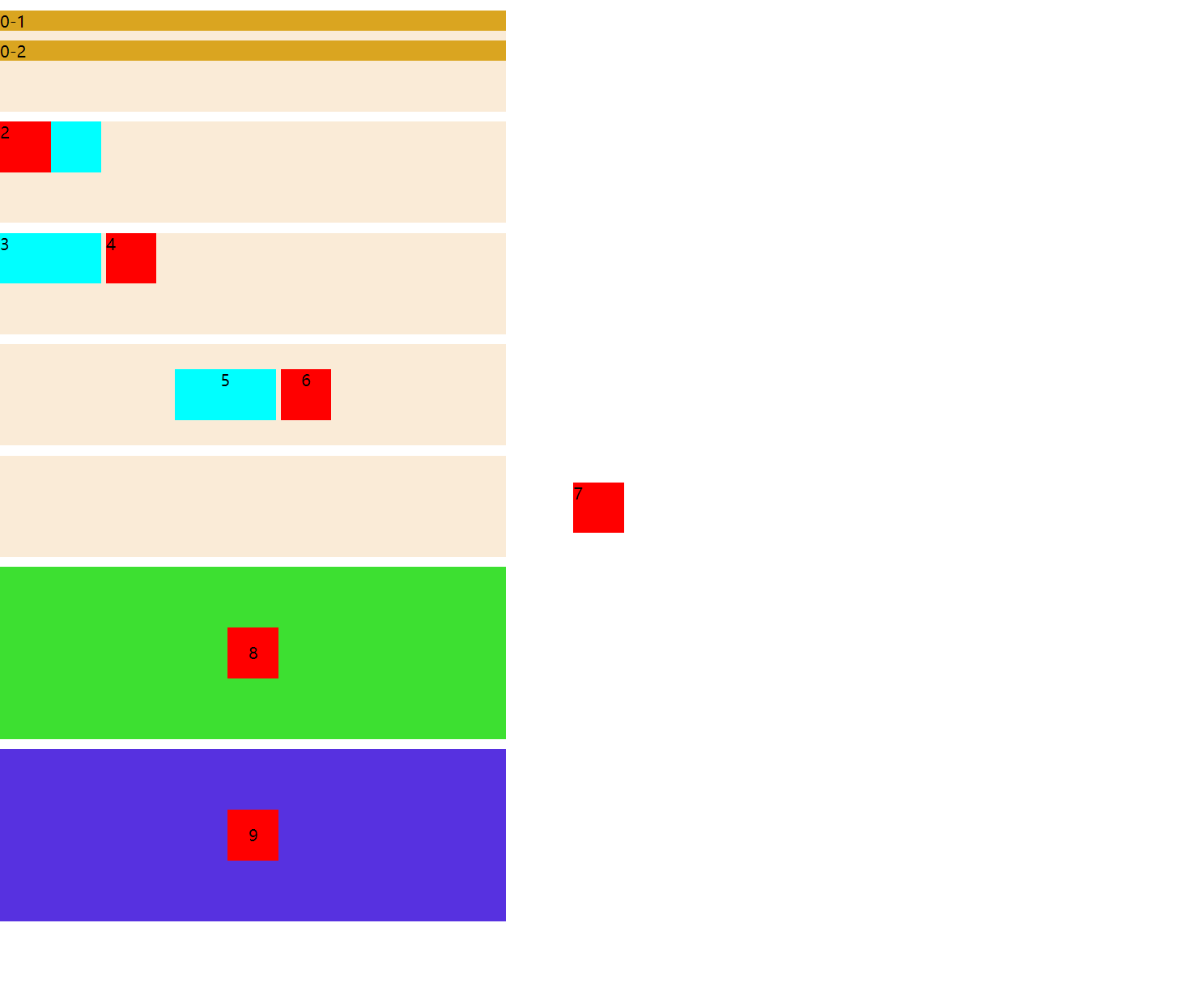
display: black: 块级元素默认是垂直流式布局,子div宽度默认是父div的100%
1
2
3
4
5
6
7
8
| <div class="parent">
<div class="mydemo0">
0-1
</div>
<div class="mydemo0">
0-2
</div>
</div>
|
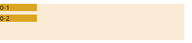
4. 重叠
1
2
3
4
5
6
7
8
9
10
11
12
13
14
15
16
17
18
19
20
| .parent {
width: 500px;
height: 100px;
background-color: antiquewhite;
}
.mydemo1 {
width: 100px;
height: 50px;
background-color: aqua;
display: inline;
position: absolute;
}
.mydemo2 {
width: 50px;
height: 50px;
background-color: red;
display: inline;
position: absolute;
}
|
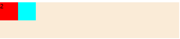
display: inline: 水平显示,宽度自动收缩,不能设置宽高,加position: absolute; 就可以设置宽高。
子div的 display: inline内联 + position: absolute;绝对定位,属性让两个子div重叠了
1
2
3
4
5
6
7
8
| <div class="parent">
<div class="mydemo1">
1
</div>
<div class="mydemo2">
2
</div>
</div>
|
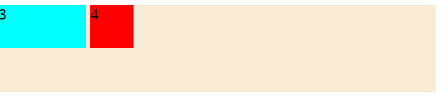
5. 水平块级排版
水平排版 + 块级
1
2
3
4
5
6
7
8
9
10
11
12
13
| .mydemo3 {
width: 100px;
height: 50px;
background-color: aqua;
display: inline-block;
}
.mydemo4 {
width: 50px;
height: 50px;
background-color: red;
display: inline-block;
}
|
1
2
3
4
5
6
7
8
| <div class="parent" style="margin-top: 10px;">
<div class="mydemo3">
3
</div>
<div class="mydemo4">
4
</div>
</div>
|
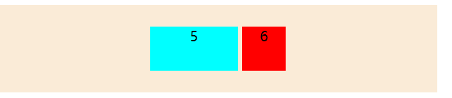
6. 通过计算边距来垂直居中
1
2
3
4
5
6
7
8
9
10
11
12
13
14
15
16
17
18
19
20
21
22
23
24
25
26
27
| .parent {
width: 500px;
height: 100px;
background-color: antiquewhite;
text-align: center;
}
.mydemo5 {
width: 100px;
height: 50px;
background-color: aqua;
display: inline-block;
margin-top: 25px;
}
.mydemo6 {
width: 50px;
height: 50px;
background-color: red;
display: inline-block;
}
|
1
2
3
4
5
6
7
8
| <div class="parent" style="margin-top: 10px; ">
<div class="mydemo5">
5
</div>
<div class="mydemo6">
6
</div>
</div>
|
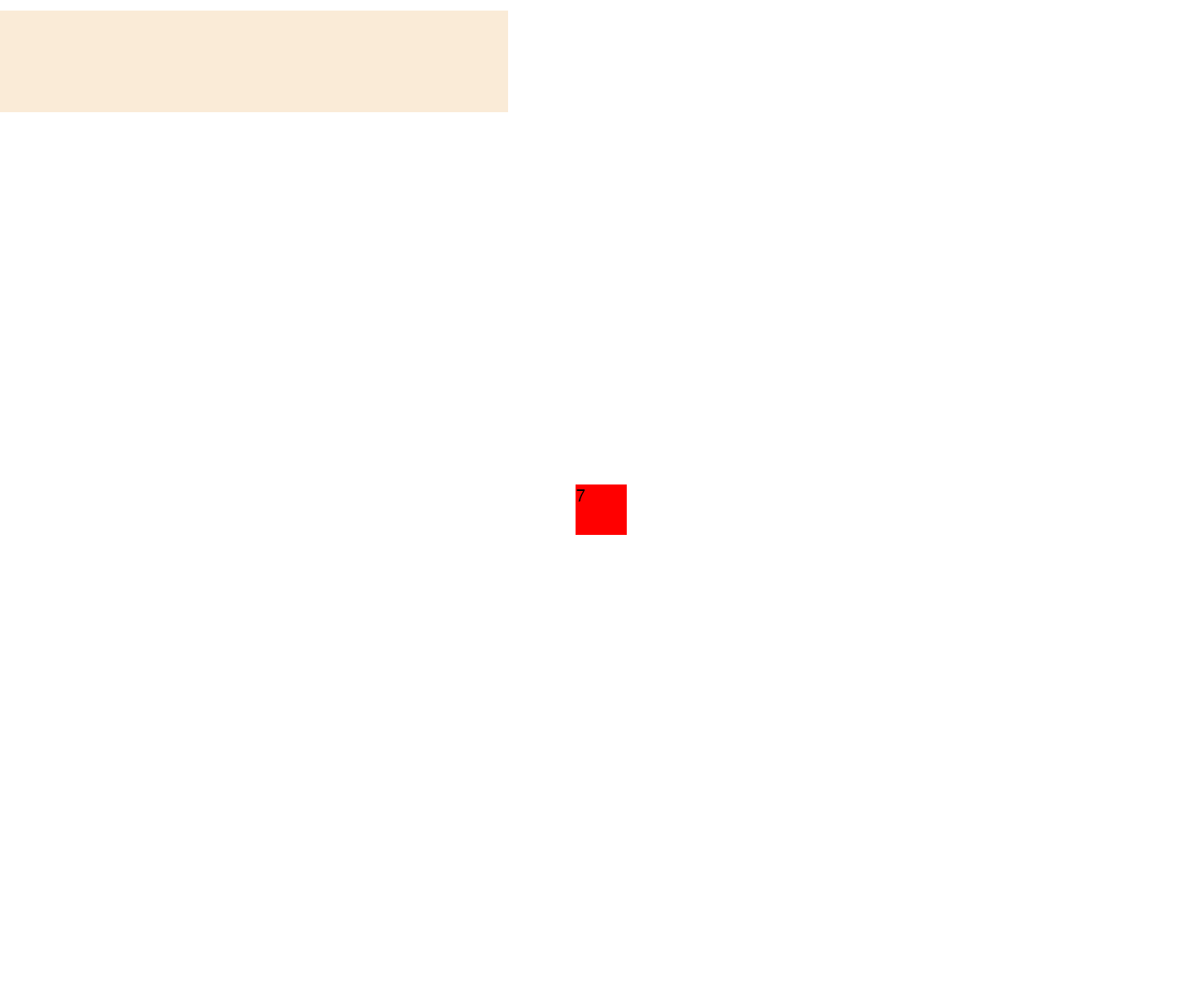
7. 相对于整个页面居中
1
2
3
4
5
6
7
8
9
10
11
12
13
14
15
| .mydemo7 {
width: 50px;
height: 50px;
background-color: red;
position: absolute;
left: 0;
right: 0;
top: 0;
bottom: 0;
margin: auto;
}
|
相对整个页面居中了(超出了父div)。
1
2
3
4
5
| <div class="parent" style="margin-top: 10px;">
<div class="mydemo7">
7
</div>
</div>
|
8. 相对于父Div居中
优化上一个的效果
1
2
3
4
5
6
7
8
9
10
11
12
13
14
15
16
17
18
19
20
21
22
| .parent8 {
width: 500px;
height: 170px;
background-color: rgb(61, 224, 49);
position: relative;
}
.mydemo8 {
width: 50px;
height: 50px;
line-height: 50px;
text-align: center;
background-color: red;
position: absolute;
left: 0;
right: 0;
top: 0;
bottom: 0;
margin: auto;
}
|
父div开启relative,子div不变,则会相对父div居中。
1
2
3
4
5
6
7
| <div class="parent8" style="margin-top: 10px;">
<div class="mydemo8">
8
</div>
</div>
|

9. flex布局的方式居中
用flex布局也可以实现,父容器开启flex布局,父容器就变成flex容器了,子容器就变成 flex item。
1
2
3
4
5
6
7
8
9
10
11
12
13
14
15
16
17
18
| .parent9 {
width: 500px;
height: 170px;
background-color: rgb(87, 49, 224);
display: flex;
justify-content: center;
align-items: center;
}
.mydemo9 {
width: 50px;
height: 50px;
line-height: 50px;
text-align: center;
background-color: red;
}
|
子div不用任何设置,
1
2
3
4
5
6
| <div class="parent9" style="margin-top: 10px;">
<div class="mydemo9">
9
</div>
</div>
|

全部代码
1
2
3
4
5
6
7
8
9
10
11
12
13
14
15
16
17
18
19
20
21
22
23
24
25
26
27
28
29
30
31
32
33
34
35
36
37
38
39
40
41
42
43
44
45
46
47
48
49
50
51
52
53
54
55
56
57
58
59
60
61
62
63
64
65
66
67
68
69
70
71
72
73
74
75
76
77
78
79
80
81
82
83
84
85
86
87
88
89
90
91
92
93
94
95
96
97
98
99
100
101
102
103
104
105
106
107
108
109
110
111
112
113
114
115
116
117
118
119
120
121
122
123
124
125
126
127
128
129
130
131
132
133
134
135
136
137
138
139
140
141
142
143
144
145
146
147
148
149
150
151
152
153
154
155
156
157
158
159
160
161
162
163
164
165
166
167
168
169
170
171
172
173
174
175
176
177
178
179
180
181
182
183
184
185
186
187
188
189
190
191
192
193
194
195
196
197
198
199
200
201
202
203
204
205
206
207
208
209
| <!DOCTYPE html>
<html lang="en">
<head>
<meta charset="UTF-8">
<meta http-equiv="X-UA-Compatible" content="IE=edge">
<meta name="viewport" content="width=device-width, initial-scale=1.0">
<title>布局Demo</title>
<style>
* {
margin: 0;
padding: 0;
}
.parent {
    width: 500px;
    height: 100px;
    background-color: antiquewhite;
}

.mydemo0 {
    height: 20px;
    background-color: goldenrod;
    margin-top: 10px;
}
.mydemo1 {
width: 100px;
height: 50px;
background-color: aqua;
display: inline;
position: absolute;
}
.mydemo2 {
width: 50px;
height: 50px;
background-color: red;
display: inline;
position: absolute;
}
.mydemo3 {
width: 100px;
height: 50px;
background-color: aqua;
display: inline-block;
}
.mydemo4 {
width: 50px;
height: 50px;
background-color: red;
display: inline-block;
}
.mydemo5 {
width: 100px;
height: 50px;
background-color: aqua;
display: inline-block;
margin: 25px;
}
.mydemo6 {
width: 50px;
height: 50px;
background-color: red;
display: inline-block;
}
.mydemo7 {
width: 50px;
height: 50px;
background-color: red;
position: absolute;
left: 0;
right: 0;
top: 0;
bottom: 0;
margin: auto;
}
.parent8 {
width: 500px;
height: 170px;
background-color: rgb(61, 224, 49);
position: relative;
}
.mydemo8 {
width: 50px;
height: 50px;
line-height: 50px;
text-align: center;
background-color: red;
position: absolute;
left: 0;
right: 0;
top: 0;
bottom: 0;
margin: auto;
}
.parent9 {
width: 500px;
height: 170px;
background-color: rgb(87, 49, 224);
display: flex;
justify-content: center;
align-items: center;
}
.mydemo9 {
width: 50px;
height: 50px;
line-height: 50px;
text-align: center;
background-color: red;
}
</style>
</head>
<body>
<div class="parent">
    <div class="mydemo0">
        0-1
    </div>
    <div class="mydemo0">
        0-2
    </div>
</div>
<div class="parent" style="margin-top: 10px;">
<div class="mydemo1">
1
</div>
<div class="mydemo2">
2
</div>
</div>
<div class="parent" style="margin-top: 10px;">
    <div class="mydemo3">
        3
    </div>
    <div class="mydemo4">
        4
    </div>
</div>
<div class="parent" style="margin-top: 10px; text-align: center;">
<div class="mydemo5">
5
</div>
<div class="mydemo6">
6
</div>
</div>
<div class="parent" style="margin-top: 10px;">
    <div class="mydemo7">
        7
    </div>
</div>
<div class="parent8" style="margin-top: 10px;">
    <div class="mydemo8">
        8
    </div>

</div>
<div class="parent9" style="margin-top: 10px;">
    <div class="mydemo9">
        9
    </div>

</div>
</body>
</html>
|